Pin It: A Decision Log for Design Teams
A collaborative decision log for design teams. Conceived, designed, and shipped in under a week.
The Problem
Design teams make dozens of decisions every week: in reviews, Slack threads, standups, hallway conversations. Most of those decisions disappear. Two weeks later: "Who changed this and why?" "Didn't we already decide this?"
Git tells you what changed. Slack tells you who talked. Notion tells you what was documented. None of them tell you why decisions were made.
That gap has a cost: rework, misalignment, and meetings that exist only to reconstruct context that should have been captured the first time.
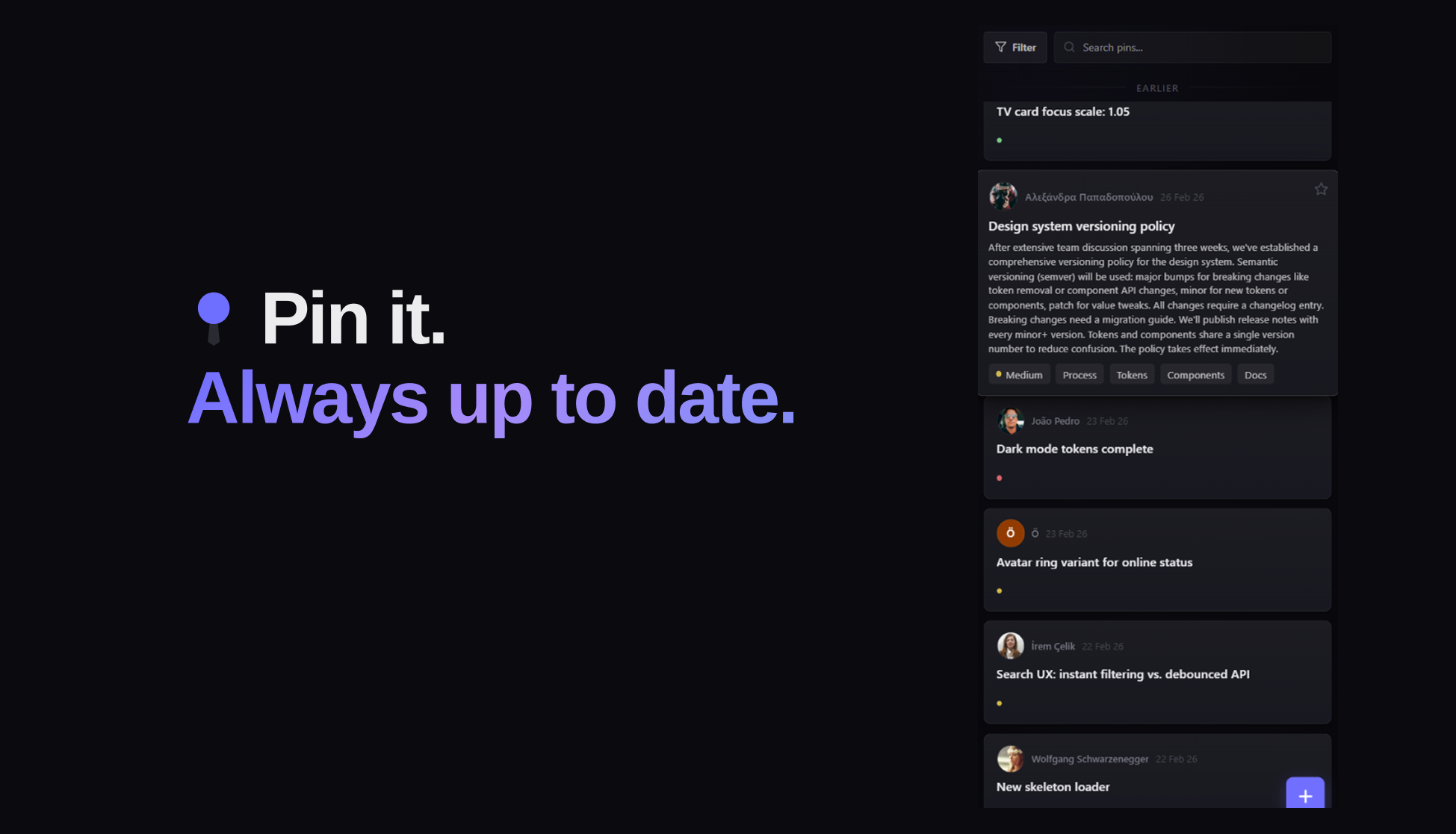
Pin it. Always up to date.
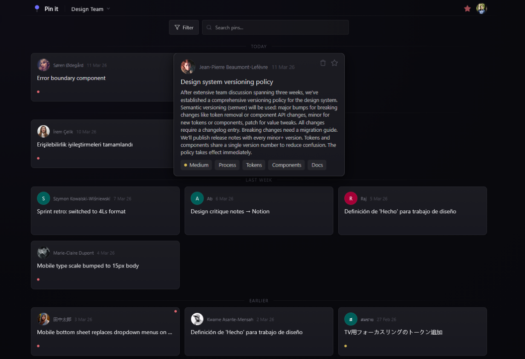
Pin It is a collaborative decision log for design teams. When someone changes a token, deprioritizes a feature, or makes any call that affects the team, they pin it. Title, rationale, tags, priority. Posted in 10 seconds.
The whole team stays aligned without extra meetings. The feed becomes the single source of truth for why the product looks the way it does.
Built with React, Firebase Auth, Firestore, and Tailwind. Hosted on Vercel. Live at getpinit.com.
No Figma. No developers. Just specs and an AI coding agent.
Every feature started as a written spec: problem, desired outcome, edge cases, acceptance criteria. The spec went to Claude Code, an AI agent that reads the full codebase and implements the feature directly.
The designer stayed in control of every product and UX decision. The AI handled implementation. The result: a fully custom component library documented in Storybook, comprehensive Firestore security rules, rate limiting, input sanitization, and a shipped product.
This is not a prototype. It is a live product with real users.
What It Proves
Product thinking without a team
Identifying a real problem, scoping a product to solve it, making every prioritization call, and shipping. These are leadership decisions. Pin It is proof that design leadership is not about managing people. It is about owning outcomes.
A designer who ships
Custom components. Security architecture. Responsive design across mobile, tablet, and desktop. A full design system documented in Storybook. Zero external UI libraries. Built by one person, in production, ready for real teams.